SSC BARI
Services Rendered
– Logo Design
– Brand System
SSC Bari is an Italian football club currently playing in Serie B, with a long history tied to Serie A.
Founded in 1905, it represents one of the symbols of Italian football — and one of the most prominent teams in Southern Italy, a region that has often struggled to stand out in a landscape dominated by the three Northern giants: Juventus, Milan, and Inter.
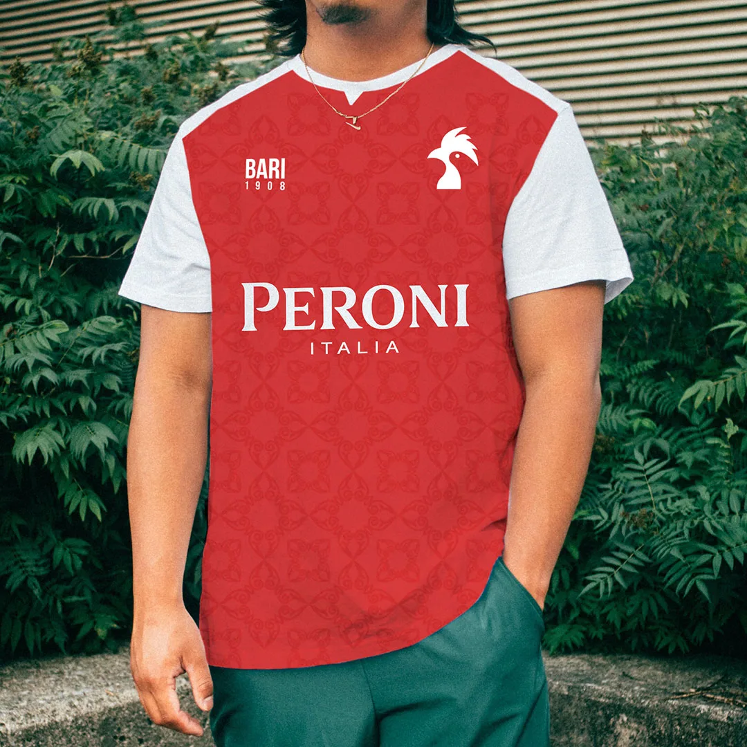
The goal of this rebranding project (never officially proposed to the club) was to modernize the team’s visual identity while preserving its historic symbol. Known as “I Galletti” (“The Cockerels”), Bari’s identity revolves around its traditional red-and-white colors.

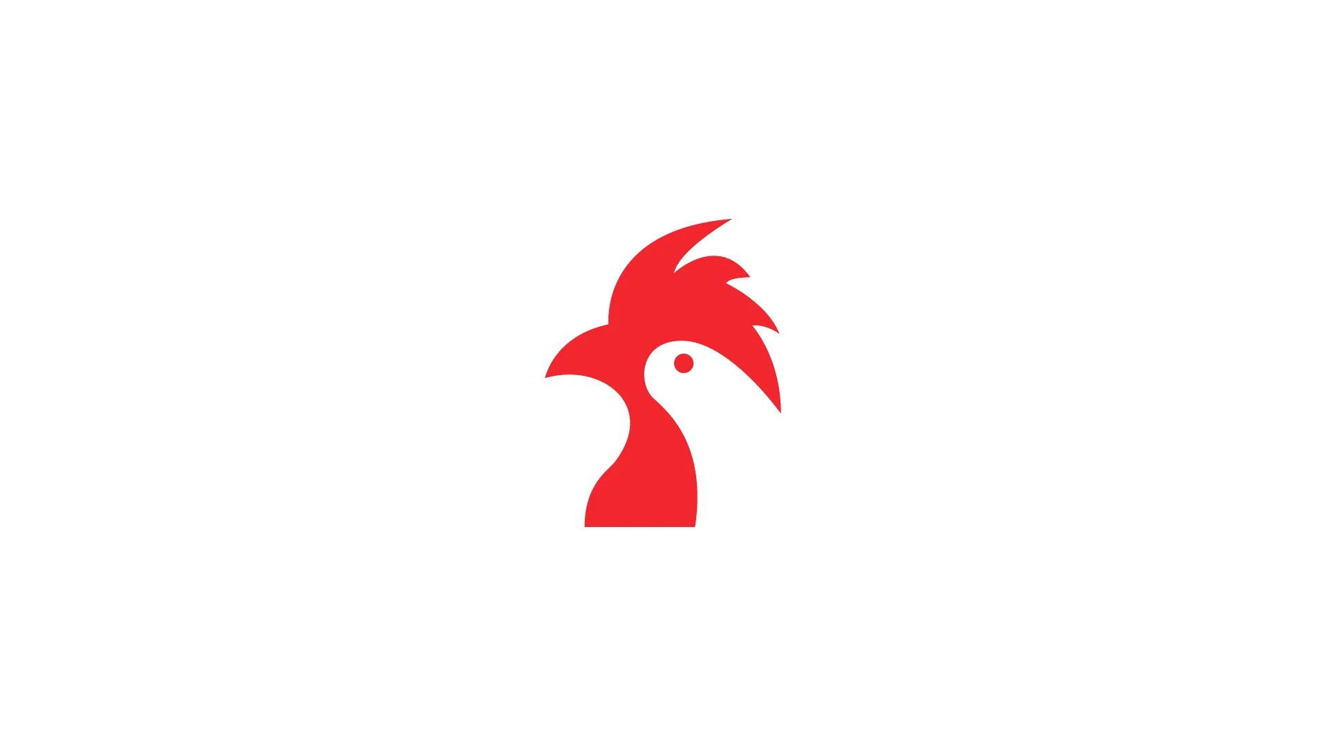
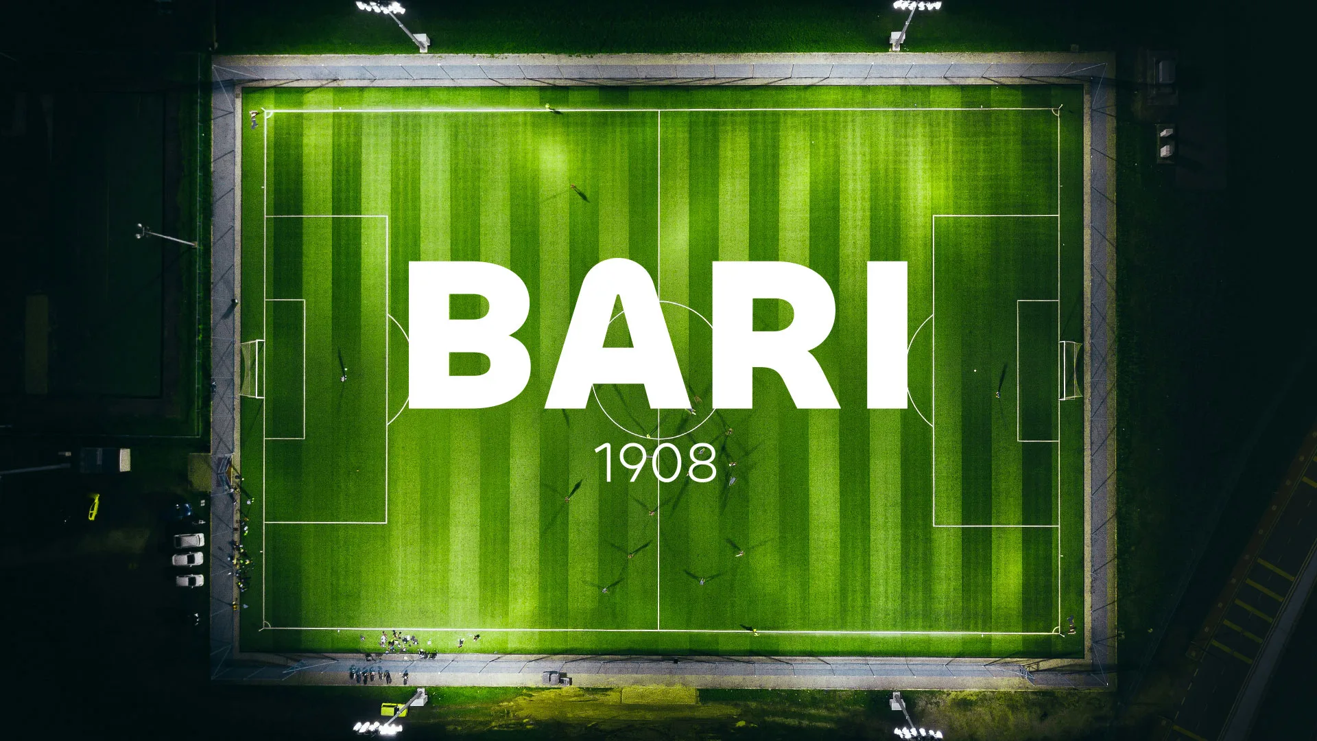
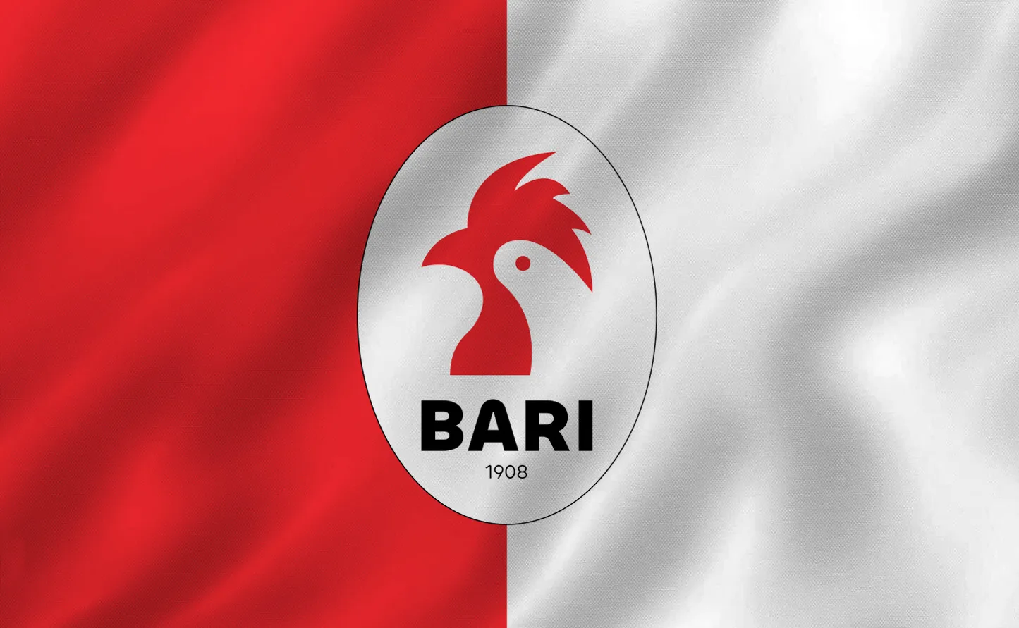
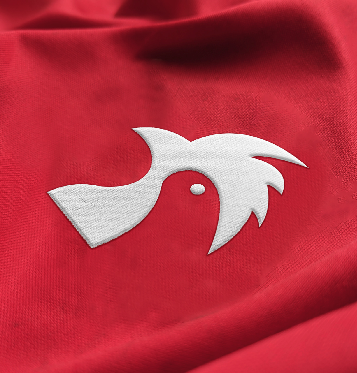
The redesign introduces a new logo, optimized for multiple formats and improved recognizability, along with a refined color palette.
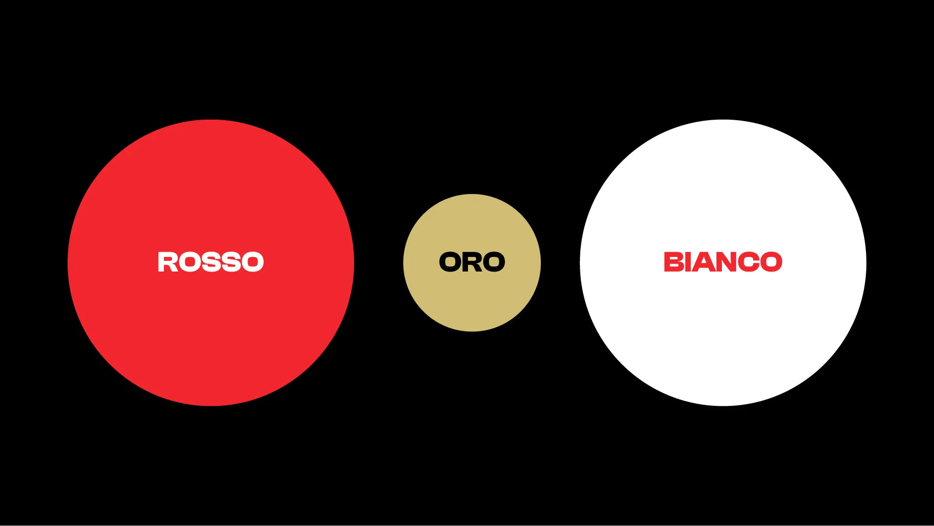
The classic red was slightly brightened to make it more vibrant and paired with white, black, and gold, resulting in a more modern and elegant visual identity.
The typeface chosen for the brand follows a modern and highly legible style.
For this reason, Bebas was selected — a typeface that combines elegance and versatility, perfectly suited to convey a strong and recognizable identity.
