KANGRATS
Services Rendered
– Brand Strategy
– Naming
– Logo Design
– Brand System
– Web Design
– Web Developement
Kangrats was born in 2022 with the goal of revolutionizing the job search experience.
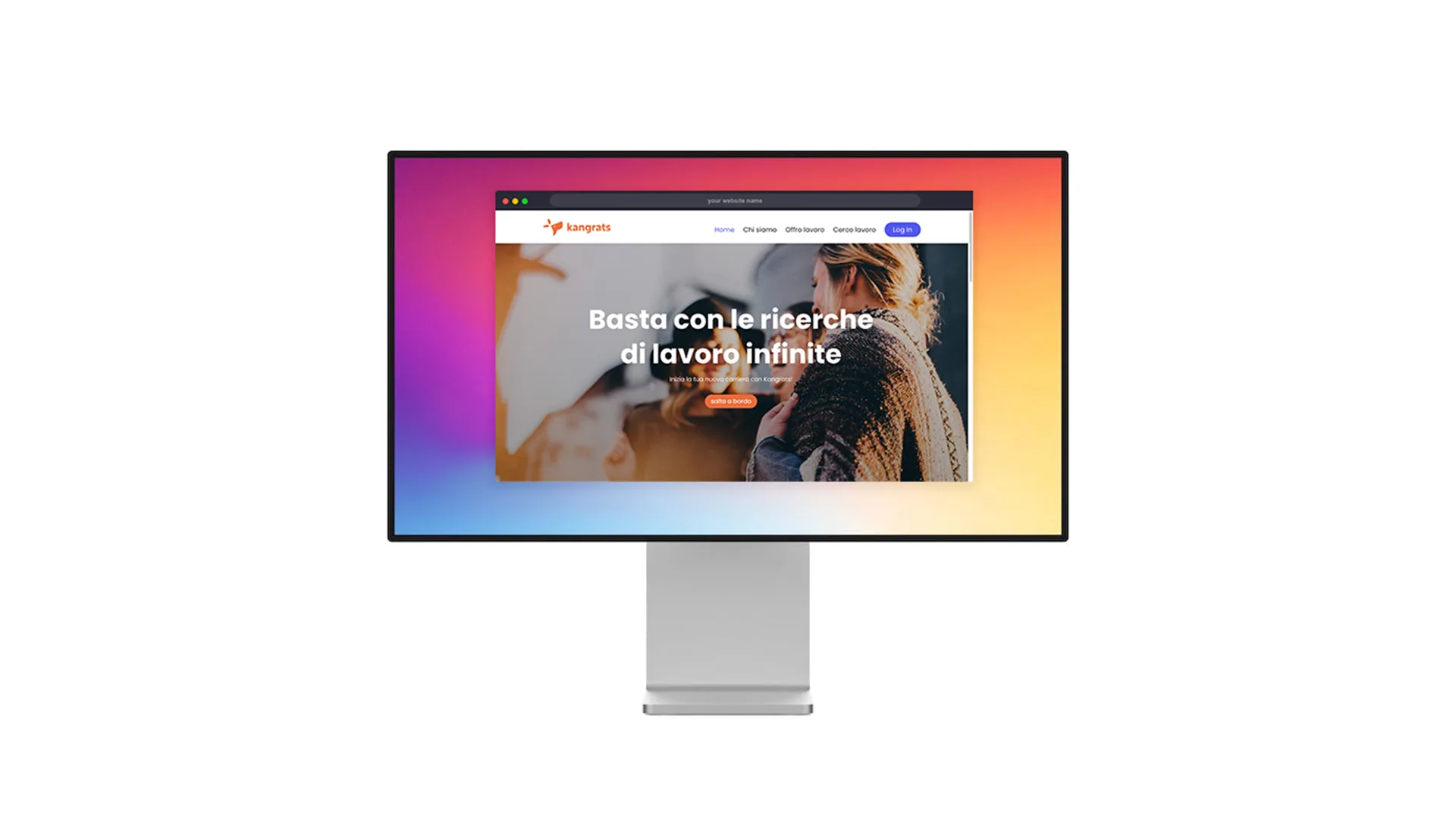
The project began that summer with the aim of developing a new visual identity — from naming to the desktop app interface.
For several months, the focus was entirely on brand strategy: analyzing the job market, defining user personas, studying their preferences, and exploring positioning opportunities in a highly competitive field.

The naming process started from the idea of celebrating the joy of finding a new job.
Inspired by the word “Congrats”, the team wanted something evocative and memorable, rather than purely descriptive.
That’s how Kangrats was born — a playful fusion of “kangaroo” and “congrats”.
The kangaroo symbolizes agility and forward motion, perfectly reflecting the app’s mission: making job searching faster, smoother, and more accessible.


The logo features a happy kangaroo inside a speech bubble, representing the connection between candidates and employers through direct and effortless communication.
Typography and colors were chosen to convey a fresh, youthful feel, targeting an audience under 30.
The main color, orange, stands out from the usual blues and purples used by competitors, creating a vibrant and recognizable visual identity built on bold contrasts and dynamic energy.
