Oink Bike
DISCIPLINES
Brand Strategy
Identity design
Logo Design
Lettering
Illustration
YEAR
2023
HOW IT STARTED
Oink, a bike lab nestled in Turin’s Santa Rita area, aspired to be more than just a bike repair shop for locals. It aimed to foster a vibrant community where a unique breed of cyclist could find a home and embrace their distinctive characteristics. The name “Oink,” chosen by the client, playfully alludes to the muddy trails conquered by MTB (mountain bike) riders, cheekily associating them with the sound that pigs make.


THE LOGO
To resonate with Oink’s target audience, we crafted a dynamic visual identity featuring two logos suitable for diverse contexts. The first is a custom lettering logo designed to embody a street style that effortlessly connects with the MTB world. It stands apart as a distinctive mark that captures the essence of Oink.


THE ILLUSTRATION
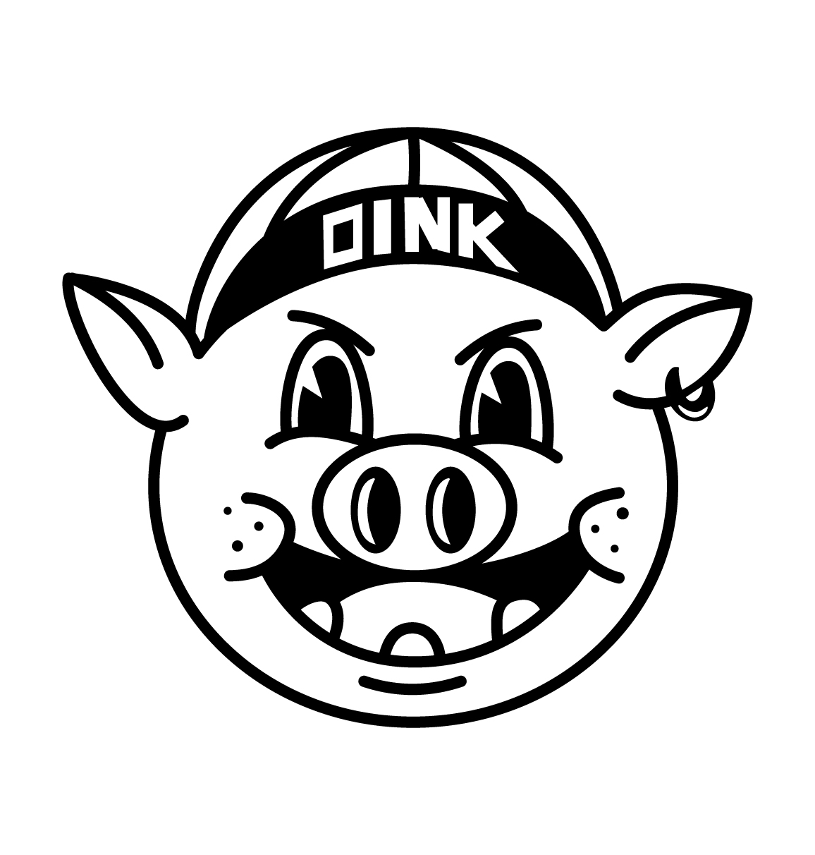
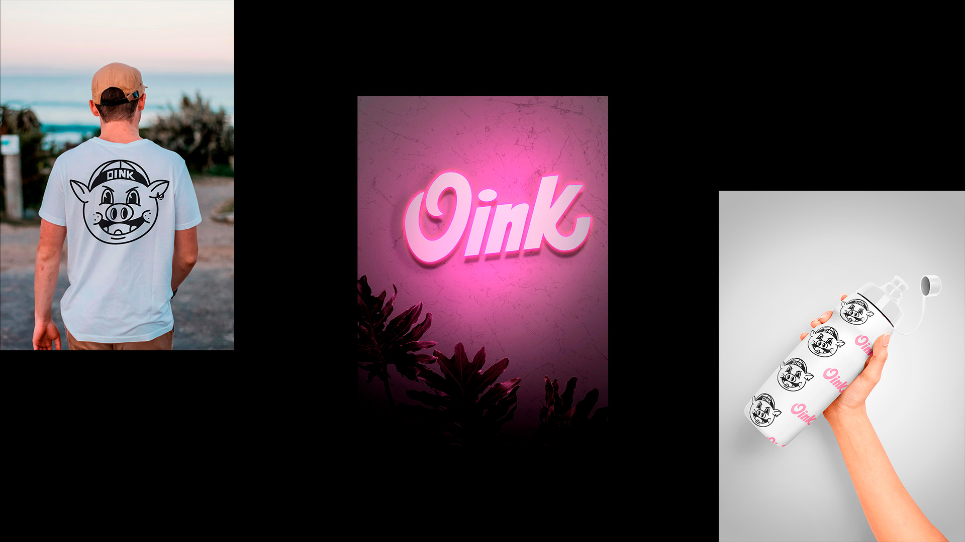
The illustration featuring a pig adorned with a cyclist’s hat serves as a direct appeal to our target audience. It aims to become a recognizable emblem adorning products like hats, shirts, water bottles, stickers, and other merchandise proudly embraced by cyclists not only in Turin but also beyond.


THE CHROMATIC PALETTE
In pursuit of a consistent visual identity, I engineered a comprehensive visual system, including a carefully curated color palette. This palette subtly pays homage to the MTB realm while daringly differentiating itself.
Oink’s aesthetic revels in its slightly rugged charm, with colors drawing inspiration not only from the pig’s pink hue but also from complementary and “clash colors” reminiscent of traditional Italian workshops, reminiscent of the vibrant spirit of the 1970s.


