Oink Bike
AttivitàBrand StrategyIllustrationLogo DesignBrand System
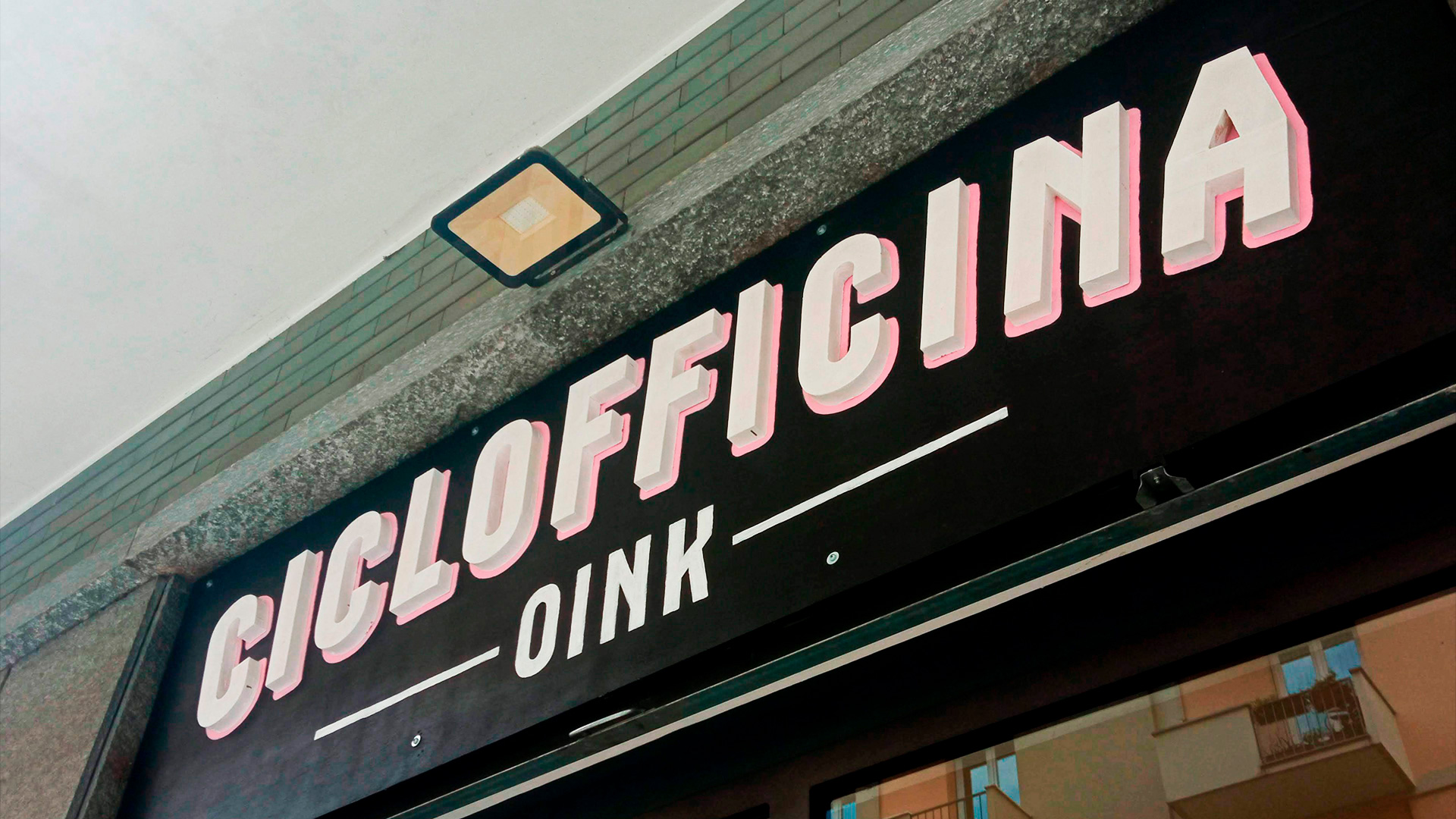
Oink is a bike lab located in the Santa Rita district of Turin.The collaboration began with the idea of creating something more than just a shop where locals bring their bikes for repairs. The goal was to build a community and an environment where a certain type of cyclist could identify with — and even laugh at — their own quirks.
The name “Oink” was chosen by the client as a playful reference to the muddy trails where MTB (mountain bike) enthusiasts ride, linking it to the sound made by pigs.

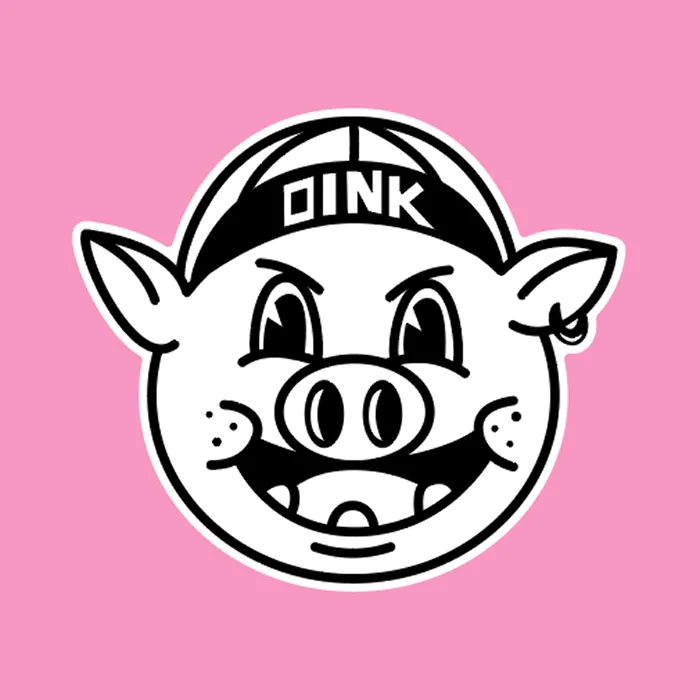

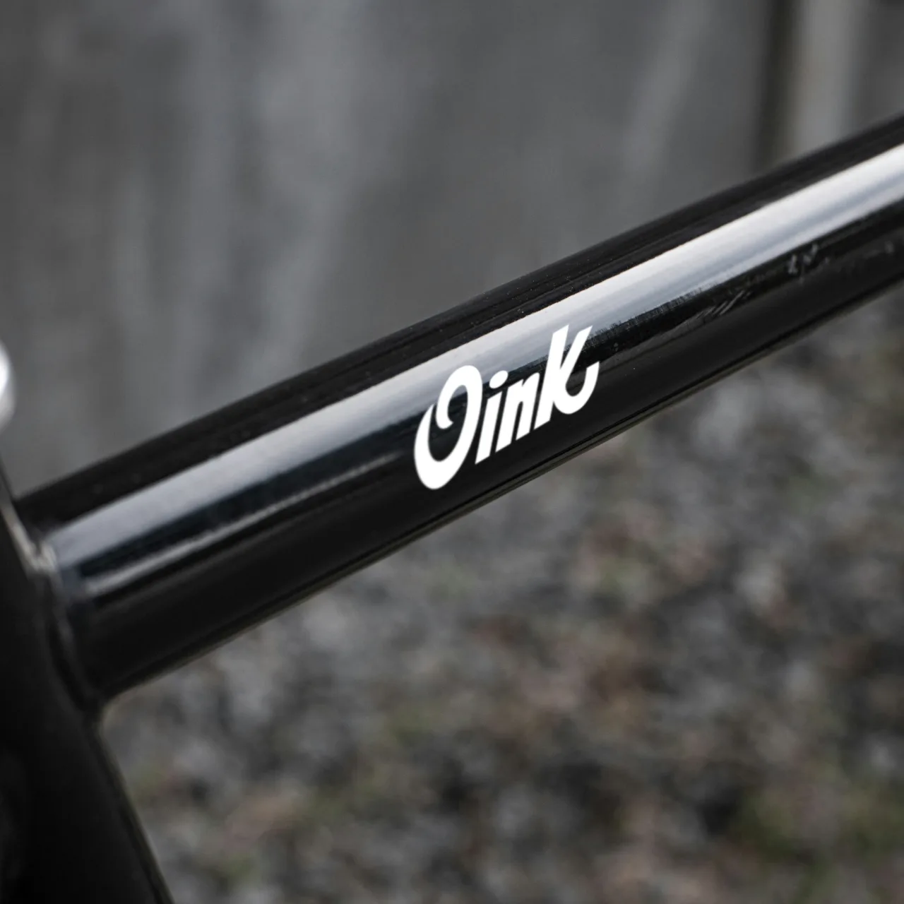
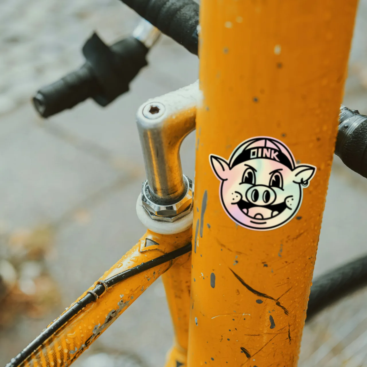
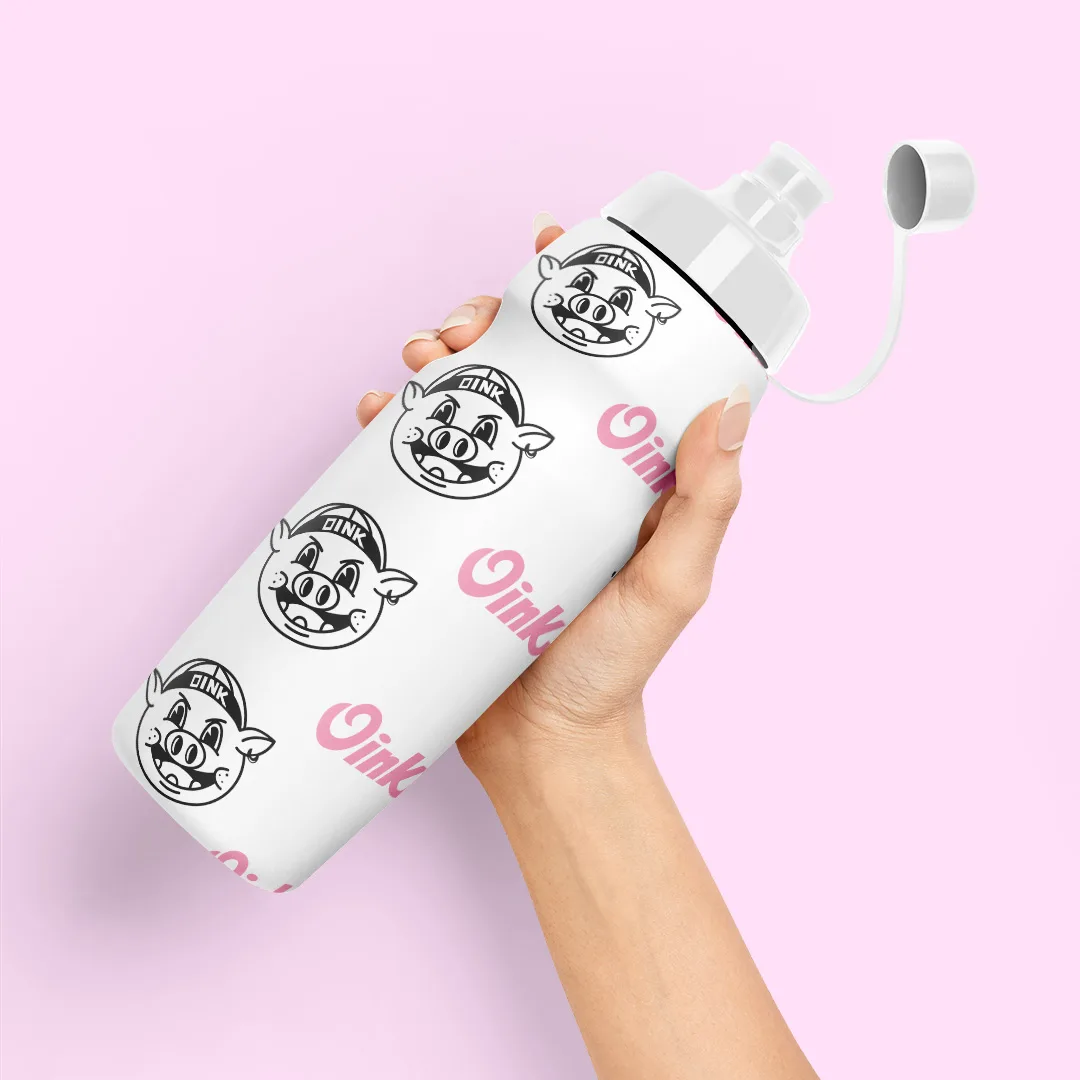
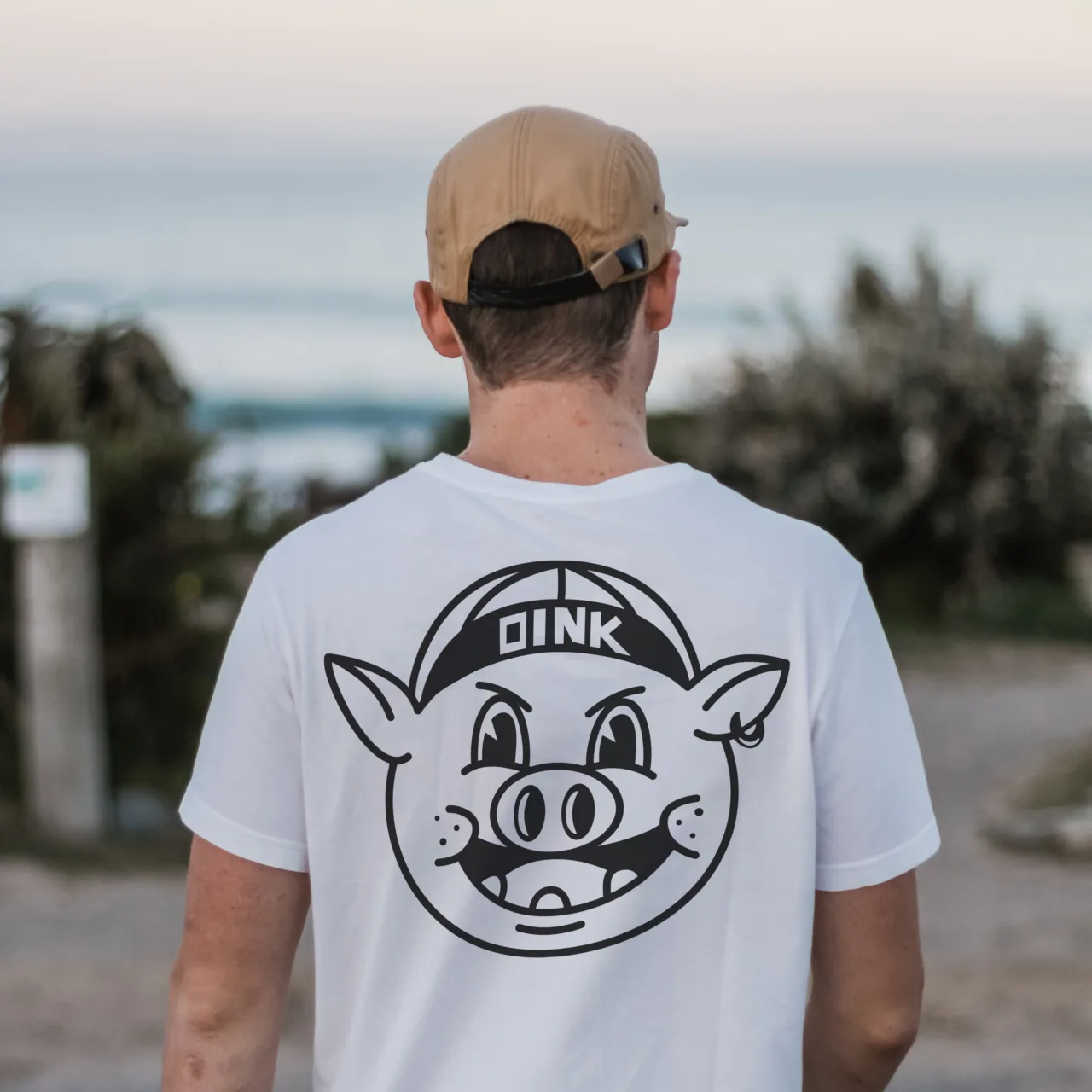
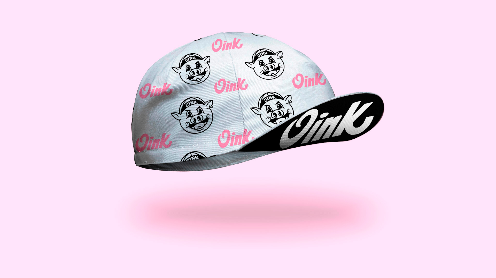
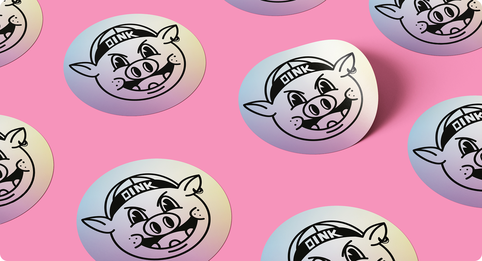
he illustration features a pig wearing a cycling cap, a direct nod to the brand’s target audience. The goal was to turn this character into a recognizable brand icon, adaptable across various products — from caps and T-shirts to bottles, stickers, and other merchandise that cyclists in Turin and beyond can wear with pride.
To ensure visual consistency, we developed a color system inspired by the MTB world — yet intentionally breaking away from it.While the cycling scene is often clean and refined, Oink embraces a deliberately rougher aesthetic.The color palette not only recalls the pig’s pink, but also includes complementary hues and contrasting tones inspired by 1970s Italian workshops, resulting in a distinctive and instantly recognizable identity.